
Domain update on July 2 Saturday between UTC 8:00 and 20:00
(drawings made during this time may potentially be lost)
Level: ESTABLISHED
Joined: 2022-05-25 17:24:12 Last active: 2024-03-02 11:02:45
Start a strip! Prove us you are a human!
    as a new user you are a limited member:
    - you can only make new strips
    - and only comment on your own strips

    please prove us that
    you are a human*
    and you will be
    a full member in no time!**

    *just draw something
    **1-2 days max (it's a manual process)

420
Aluminimalism
🤖

comments made: 89
2024-03-02 11:02:45

Uploads were allowed by default on PanelJam, as long as you were a premium member. Established is probably PChutney's equivalent of that.
Being able to turn uploads off for special challenges or whatever seems fine, but I'm not sure why it should be the stock configuration.
2024-02-27 20:15:08
It's frankly really impressive you remembered this strip to go back and make this joke! Great work, `🔳`
2024-02-23 07:27:26

2024-02-23 07:02:55
Isn't the text on comments on panels light gray with a black outline? It also shows the comment as a tooltip when you hover over the panel if it's hard to see or too long to fit into the panel!
2024-02-09 12:20:57
Which is part of the reason I'm suggesting also putting a button on the page to "unfilter"/"show all"
Like right at the top
Plus you can see the group the strip is in on the strip's page and it will link to it!
Something like this

And then after pressing the SHOW ALL button

2024-02-09 11:47:26
I think the Groups page should have a blurb at the top of the page, cause yeah the name isn't really that self-explanatory.
Something like "Groups are collections of strips users can assign for sorting series and themes. Learn more about them HERE [link to wiki article]"
Also, when it comes to the Groups page! I feel like groups with fewer than two entries should be filtered out by default. A group of one is hardly a group! But have like a button that lets you unfilter the one-strip groups if you want to see what tags are already in use
It would help make browsing the page easier!
2024-02-08 12:44:17
I would not recommend the footer approach. It took me years of being on Drawception to find out there was a forum, cause it was hidden in the footer.
Having a site map on the footer isn't terrible, but it shouldn't be the sole method of accessing features!
2024-01-28 08:56:23
Oh yeah, that makes sense as being a bit disorienting!
What I'd suggest though is moving the login/register buttons to be where the logo goes, rather than the logo being the login button.
That should make it both clear to users who aren't used to the layout yet, but also convenient to PanelChutney veterans who are used to clicking on the top right corner!
2024-01-27 16:33:53
It's actually normal to have gym in the morning, before all your obligations for the day, rather than in the evening where you're likely already quite tired! Also helps you wake up and perk up for the day ahead!
2024-01-25 19:17:51
You don't need to have a game passed to you to participate in it, as long as it's open to the public and no one has it claimed!
Passes exist basically as a means of reserving a spot on a friend's behalf.
2024-01-23 20:34:01

`Peyo`
I'd guess [this](https://www.youtube.com/watch?v=2ZBtPf7FOoM)?
2024-01-18 18:06:25
Oh that must have been what happened a while back when I tried to access the site and it threw me an error like
"Időtúllépés, a kapcsolat szerver oldali időtúllépéssel megszakladt."
whatever that means!
2024-01-05 15:50:03
You could probably have the date display when you hover over the panel? Maybe as an extra line after the description, or as a separate text box that aligns with the bottom of the panel
2023-12-29 07:25:35
`noob`
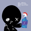
Just avoid the punch. I'm pretty sure it's just red window cleaner!

2023-12-19 12:43:16
I like the little animation for the icon, it's cute!
Noticeable, but subtle enough to not be distracting
2023-12-17 13:13:08
I'm guessing the idea is to have that, but without the game being hidden from everyone else. Kinda like a Friends Only game, but with a more curated list?
2023-12-10 15:14:17
This is brilliant! Works perfect!
Thanks for adding this
2023-12-08 11:07:31

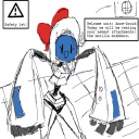
A quick sketchie of the kobold

This comic is looking pretty good so far!
2023-11-29 19:49:15
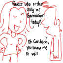
`TeeEffDee` She decided to take a more active approach the business!
2023-11-29 17:31:59
The setting could also be used to disable the screen-filling banner on NSFW strips. I'd still have the warning label, just to make it clear it's marked as NSFW, but not have the whole bit where you need to scroll down a bunch to see anything!
2023-11-24 09:39:24
That would be kinda neat!
Maybe something like this?

2023-11-13 08:47:37
The "Don't have an account yet? Get one here!" button on the login page is a bit too wide for mobile, and ends up breaking the layout

Easiest fix probably would be to make "Don't have an account yet?" plain text and then "Get one here!" be the button/link on a new line
2023-11-09 08:36:53
What version of PHP and what kind of database does the site use? I might have to start learning these so I can help with clean-up and implementation!
2023-11-09 08:30:45
Making a separate thread for this just for tidiness.
I think you do intend to clean up the site code at some point, and when you do, I want you to reconsider using stylesheets.
You mentioned cache issues, but that would be much easier done with versioning the stylesheets. If you update it, just increment the name, a la stylesheet_main_v101.css, and propagate it to the page templates.
You realistically wouldn't even need to do it that often since how often do you update it?
The benefit would be that you wouldn't need to write all the CSS through PHP, help you slim down the code. Also if you allow the stylesheets to be cached, it'll reduce the amount of data transferred per page load.
Plus you can have multiple stylesheets should that be necessary!
Not saying you need to do it, and right now, but I hope you consider! I think it would be beneficial in the long run.
2023-11-01 19:42:57
I was actually gonna ask about it earlier what the heck is going on with the CSS on this site. I checked the stylesheet.css and it only declared the font and nothing else?
There seems to just be 8 different [style] sections on the page rules/classes just scattered across them.
Is this some PHP thing?
Also it's okay if you need time! I'll try not to be a constant nuisance
2023-11-01 18:59:38
It might actually be worse since it jumps around even more now! Are the iframes simply not loading in or what exactly is breaking?
I did some more testing, and in addition to the star not working on mobile, it seems to go offset once you go beyond 4 digit numbers, which you're over a third of the way to!
I made a streamlined version of my design to use a [cheatsheet](https://phoneychutney.neocities.org/1)
It's not ideal on mobile since it no longer has elements on the left to balance it out, but it should work.
Basically, instead of having a div with 100px padding like you do now, which also causes problems on mobile, and also seems to break on long names and descriptions, you can have a flex div that's a column, with 3 elements inside, stars, name+desc, and then the last I put the join/last seen/level in. Span might not work for them tho, I had issues with it earlier with the background overlapping with the text
012